In this blog post, we reference the Android app for SurveyCTO Collect. Beginning September 10, 2019, SurveyCTO version 2.60 introduced an iOS app for Survey Collect, allowing users to test forms on any device of their choice. We also replaced SurveyCTO Sync with SurveyCTO Desktop, the safest and most powerful way to centralize your work, export your data, manage projects, and work offline.

So this year, Dan came and asked me how hard it would be to move the actual simulation online, pre-class. While Harvard, like most U.S. universities, has an institutional license with Qualtrics for web surveys, I was skeptical that Qualtrics was up to the task. With its new web-survey support and other new features we’d added in recent months, however, I was confident that SurveyCTO could do the job. And, in fact, it only took me a few hours to put it all together.
There were aspects of the simulation that made it like a normal web survey: we wanted users to follow a simple link, work through the simulation, and then submit their responses, and we wanted to be able to easily download and analyze the resulting data. However, we had other requirements that pushed beyond your standard web survey:
- We didn’t want the user to be able to skip ahead, see what happens later in the simulation, and then go back to make their decision. We didn’t even want them to be able peek at what’s coming.
- Likewise, we didn’t want the user to be able to decide one thing, see how things turned out, then jump back and change their decision. (Alternatively: we wanted to be able to secretly record these cases where somebody went back and changed their answer.)
- We also wanted to record how long it took students to work through different stages of the simulation. For example, how long did they spend reading the initial set-up? Making their first decision? This would allow us to, for example, see if students who spent more time did systematically better.
- And finally, we wanted to organize the data coming out of the simulation so that it would be pre-processed, in a sense, so that it would be quick and easy to use. That way, students could complete the simulation just before class and the faculty leading the debrief/discussion could quickly integrate that data into their presentations.
While this simulation is meant to take place online, these requirements more closely resemble the kinds of advanced features that many of our SurveyCTO users require in their offline, Android-based field surveys. Luckily, we built SurveyCTO’s online web support to include essentially everything that our Android app supports.
You can see – and try! – an abridged version of the resulting simulation here:
The simulation is being piloted now, with an executive education cohort at the Kennedy School. Then, shortly thereafter, it will be used for roughly 250 Masters in Public Policy students. My guess is that the simulation will work even better online than it did in-class, but I’ll have to wait and see.
If you’re a SurveyCTO or ODK user, you might be interested to see how this simulation was actually built. If so, read on!
Anatomy of a simulation (behind the scenes for SurveyCTO or ODK users)
An abridged version of the simulation’s form definition is attached here, in Microsoft Excel format. I recommend opening it and then keeping it open as you read through the following discussion. I make use of some advanced features and do a few tricky things, so you may learn a thing or two even if you’re an expert SurveyCTO user (and even if you’re not thinking about using SurveyCTO for a simulation).
The first thing you’ll notice is that there are a bunch of long note fields, including funny-looking codes like <i> and </i>. The idea is that users of the simulation will always run the simulation on the web, using their web browsers. So we’re expecting the screen to be large and we can use HTML codes for formatting text. We would include much less text – and none of the HTML formatting – if we expected users to use this form on Android devices.
At the very top of the form, there are a few calculate fields. One tracks the total duration of time the user spends filling out the form, and two pull random draws that will be used later in the form (the draws are from a uniform distribution [0, 1]).
Below those calculate fields, there is an introductory note. This note field uses the intro appearance to override the text on the form’s opening screen (the one that typically gives the user generic instructions about how to begin).
Below that is a group with the field-list appearance, to ask a couple of questions on a single screen (in this case, the user’s first and last name).
Then, there is a lengthy screen with the full background reading for the simulation. Here, that background is actually abridged; the real HKS narrative is quite long and detailed, presenting the information in a more realistic form.
After that background is a calculate_here field that records how much time has been spent in the form so far. The idea here is to capture how much time the user spends reading over the background materials before moving on to make a decision.
Next comes the first decision point. As mentioned earlier, there are a few key things that were important to us in this simulation:
- We don’t want the user to be able to skip ahead, see what happens later in the simulation, and then go back to make their decision. Though putting “yes” in the required column forces users to respond before clicking Next, users can always click “Go to” in order to preview or jump ahead. To hide future information from even that go-to screen, I added conditions to the relevance column, so that everything would be hidden until decisions were both made and confirmed.
- We also don’t want the user to be able to decide one thing, see how things turn out, then jump back and change their answer. So, I used a well-placed calculate_here field to record their original answer once they confirmed it, then stopped them in their tracks if, later, I saw them change their answer. (It actually lets you go back and change your answer, but as soon as you confirm that new decision, it catches and stops you. We were also considering just leaving out the required note field that stops you, so that we could look in the data later to see who changed their answers!)
- We also wanted to record how long it took students to get through the first decision point. So I added yet another calculate_here field to capture the current duration just after the user confirms his or her decision.
Obviously, I made heavy use of calculate_here fields. This is very unusual. Normal calculate fields automatically re-calculate whenever something on which they depend (like a response) changes. That’s almost always what you want. But calculate_here fields only calculate when you pass that exact point in the survey form. And when you surround your calculation expression with the once() function, it will only calculate once, rather than re-calculating whenever you pass that point. For keeping track of how long it took to get to a certain point in the survey, or for recording somebody’s first answer to a question, calculate_here with the once() function is exactly what we want.
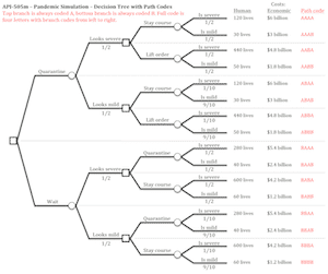
Returning to the simulation form, the next thing that happens is the first random draw is used to determine the stage-one outcome (whether the outbreak looks mild or severe after two weeks). Once that determination has been made, one of four notes is shown, to summarize the situation (there are two possible decisions and two possible stage-one outcomes, so four possible scenarios).
Next, the user is asked to make their stage-two decision, based on the new information from stage one. Again, there is great care in the relevance conditions so that future results aren’t visible to the user, there is no way to go back and change one’s answer once it has been confirmed, and the time spent up through decision two is recorded for future analysis.
At the end, there is then a final outcome reported to the student. Because we were afraid that students might see this final outcome and close their browsers without submitting their responses, we decided to put the final outcome only on the final thank-you screen, after they had submitted their responses. There were 16 possible outcomes depending on the path they took through the simulation, and so there were 16 possible summary notes at the end. Each had a relevance condition so that it would only appear for the appropriate students, and each had the thankyou appearance so that it would only appear after their responses were submitted.
Organizing data for ease-of-use

This method of coding gave us a nice “path code” for every student. When tabulated in alphabetical order, it would take only a minute to transcribe results from the data onto a decision tree that could be, for example, shown on an overhead during the in-class discussion. In this way, using calculate fields to calculate values in the form itself, we can often assemble data in a way that’s convenient for later monitoring or analysis.
Postscript: making form design easier
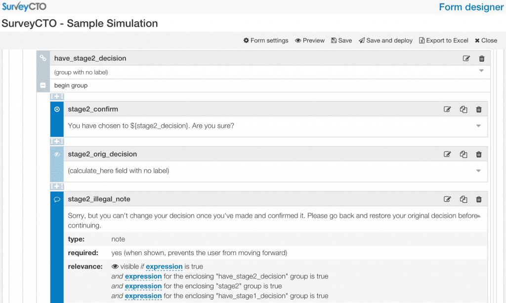
The Excel form definition is a bit intimidating, for a few reasons. One, there is a lot of grouping of fields, but that grouping is a bit hard to visualize in Excel: each group is surrounded by begin group and end group rows, but then groups are nested within each other. Two, the relevance conditions that control what displays when are influenced by these groups, so for example a field inside the have_stage1_decision group only displays when we already have a stage-one decision. And while I tried to name the groups in a suggestive way, this method by which fields inherit their groups’ relevance conditions is not easy to follow in Excel.
We have tended to be big fans of Excel-based (or Google Sheets-based) form design, because you have a concrete record of every version of every form; because you can easily copy, paste, and collaborate; because you can easily work offline; and more. But there are definitely drawbacks.
So I have a confession to make: when working on this simulation, I cheated and used our new drag-and-drop form design tool. And wow, what a difference! We’ll be blogging about that soon, but until then just an example of how things look in the form designer:


